02 / 11
Dosé Haus
- Year
- 2026
- Location
- Istanbul
- Discipline
- Brand identity & packaging
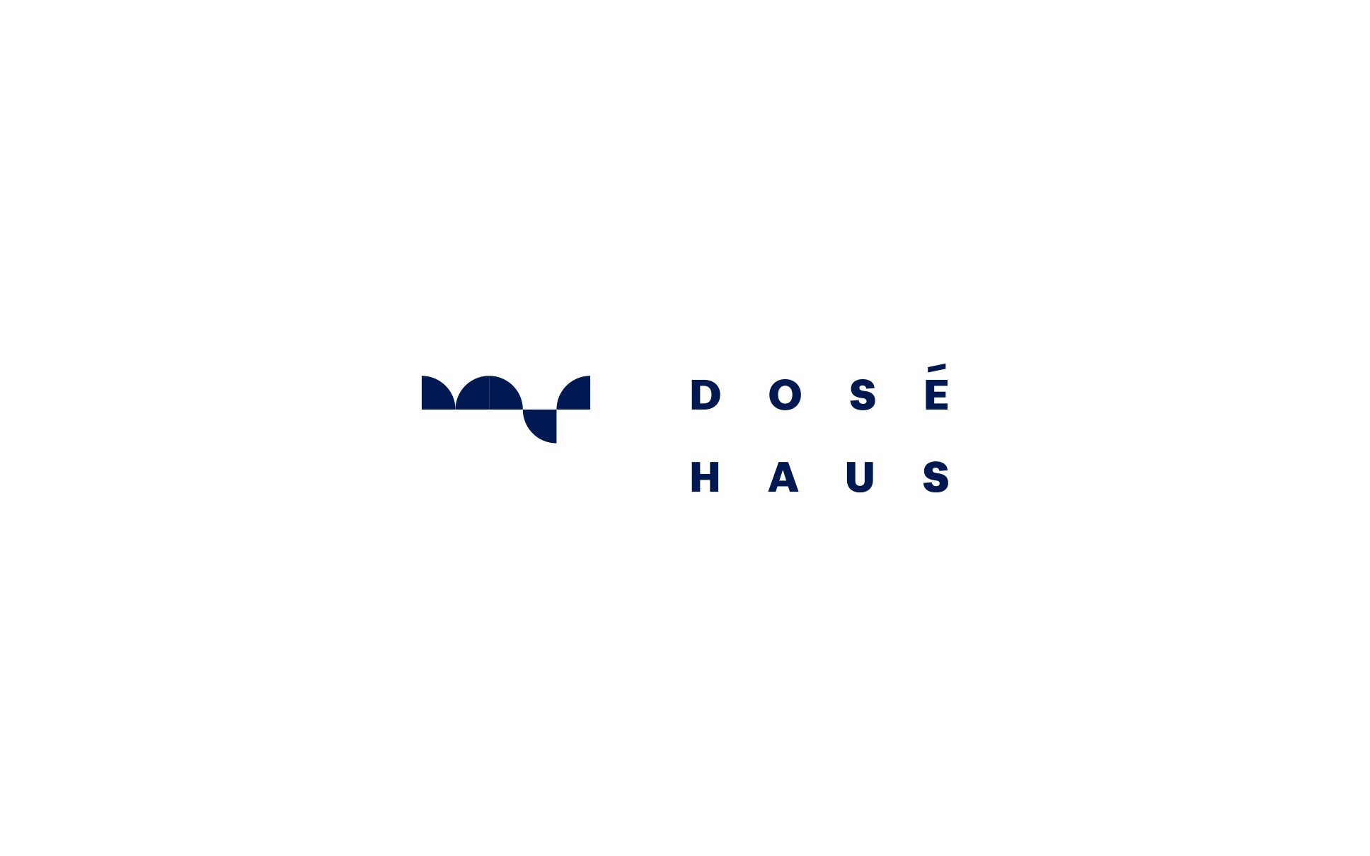
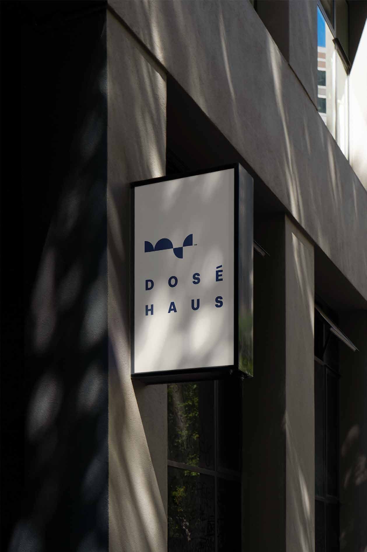
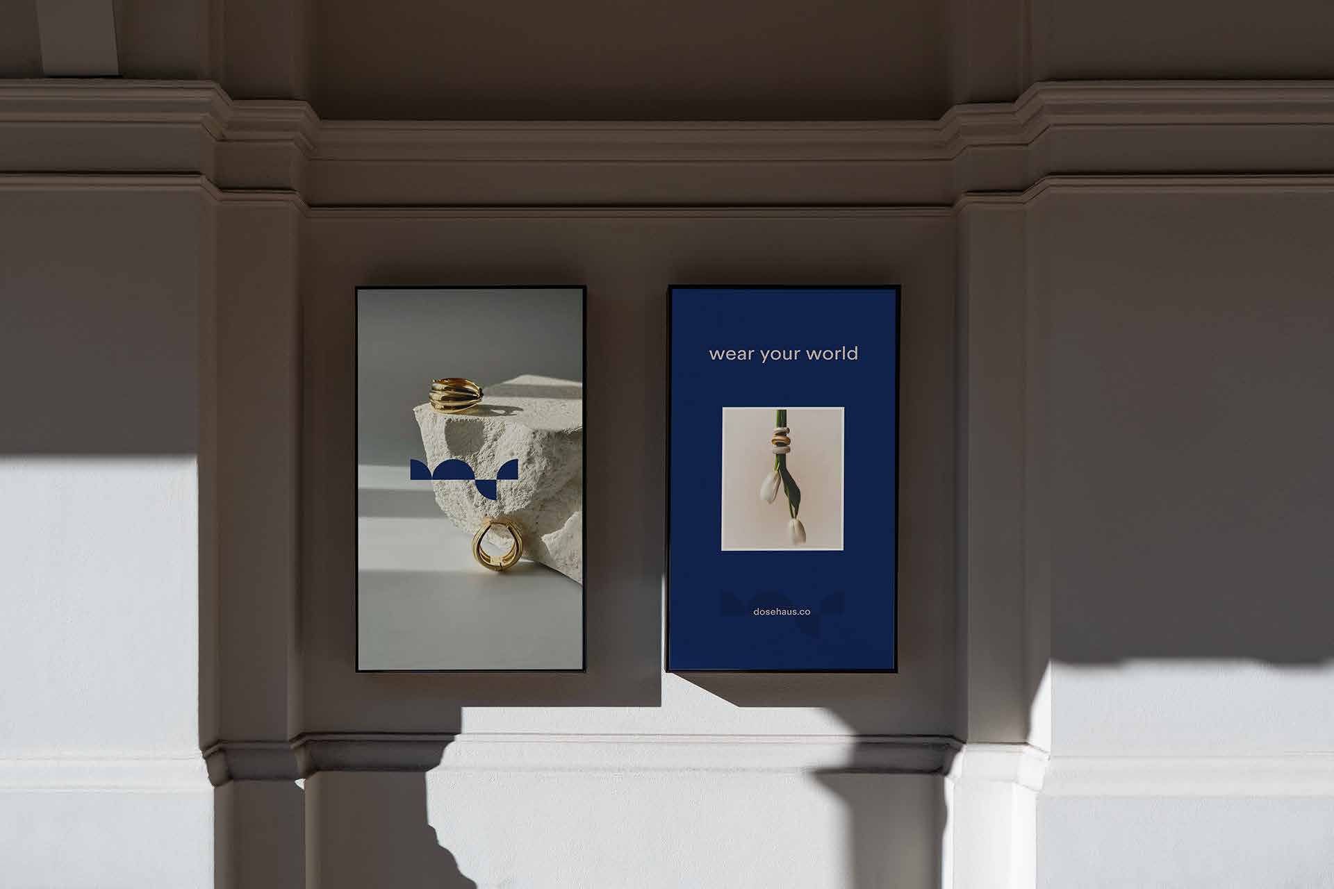
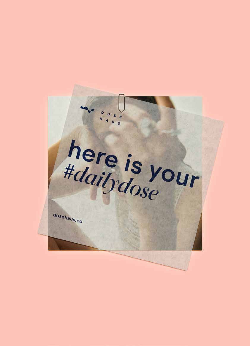
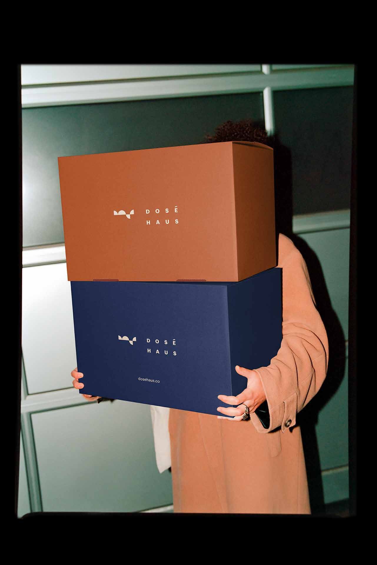
Dosé Haus is a new contemporary jewelry and accessories brand built for people who use style as a way of editing themselves, not decorating themselves.
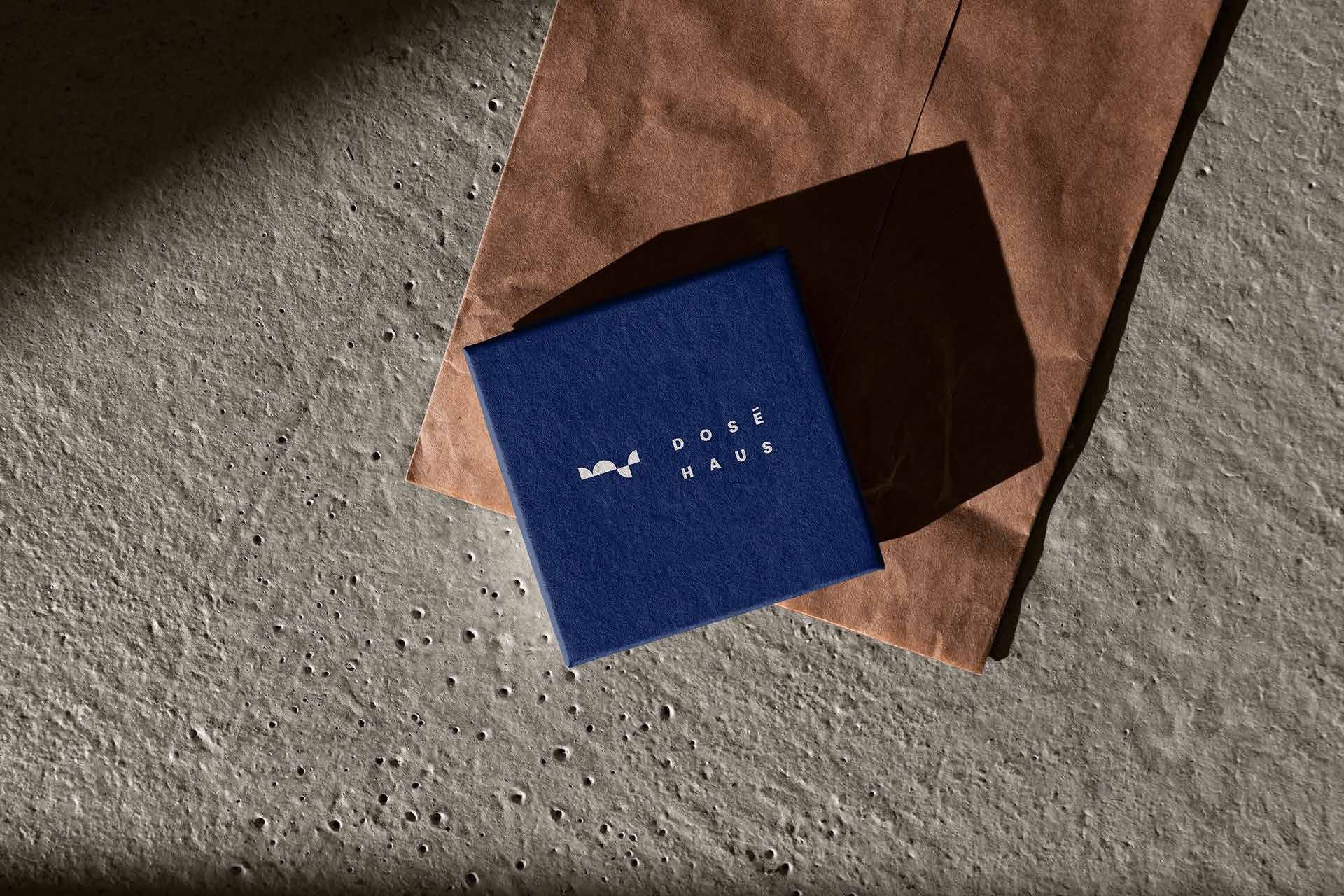
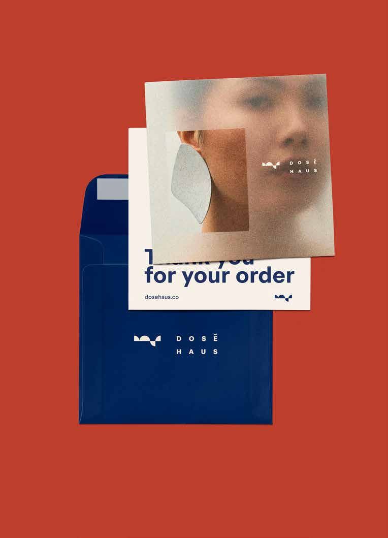
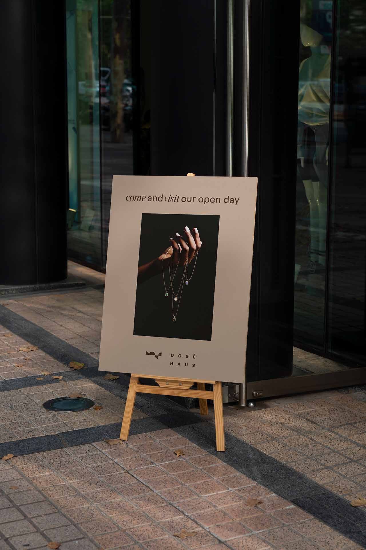
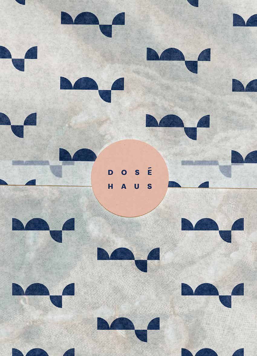
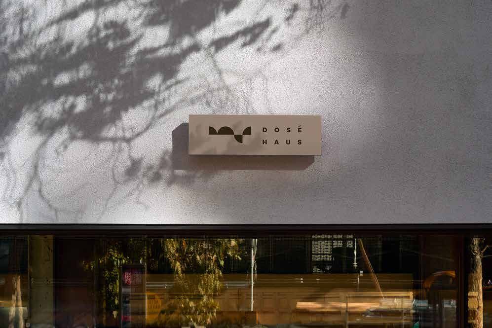
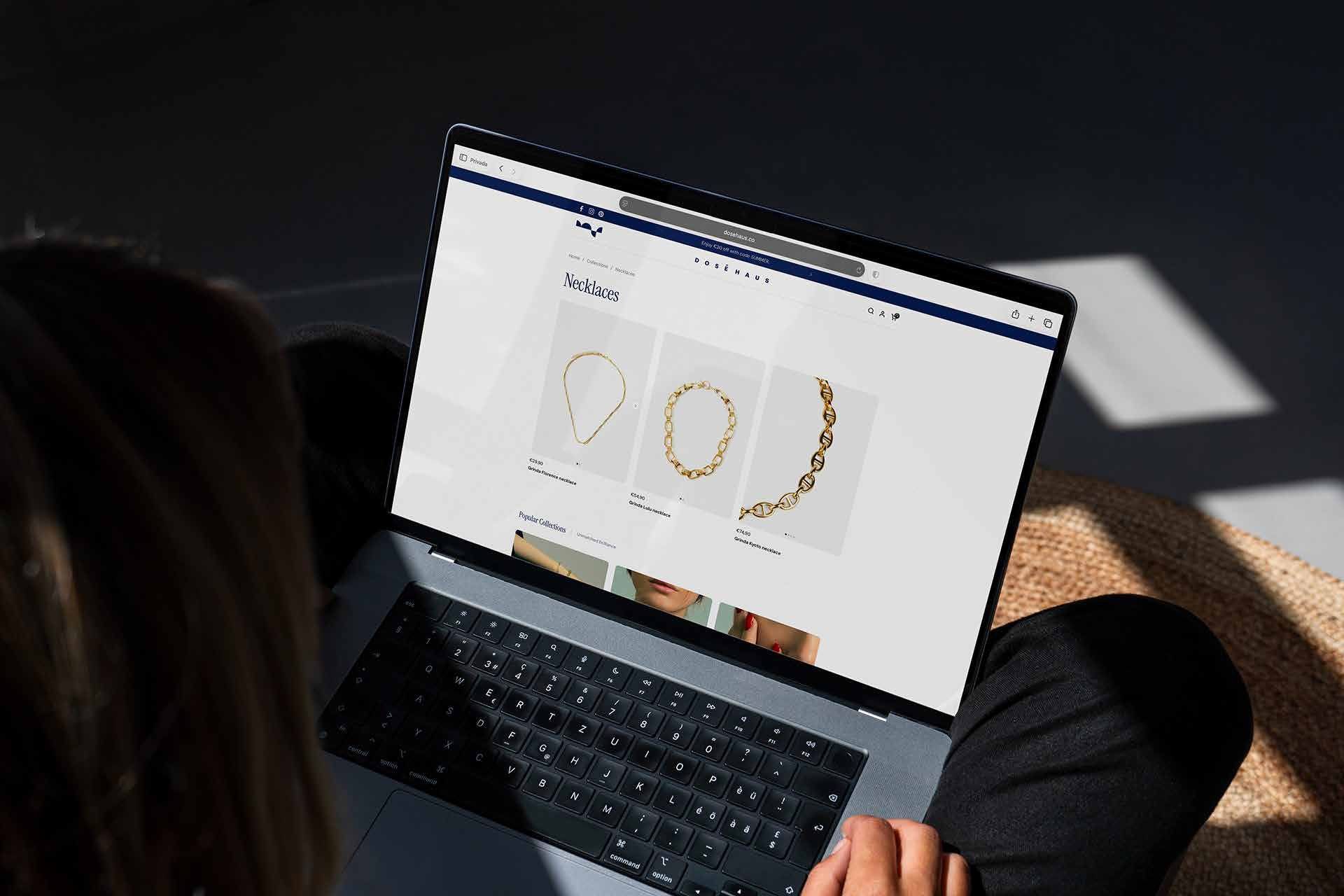
The category was crowded with brands that were either visually polished but cold, or energetic but visually scattered, so the goal was to create a brand that felt both expressive and coherent. As art director, I shaped the identity to reflect that balance: playful but considered, editorial but accessible, colorful but never cheap. I built the visual world around the idea that accessories are not standalone objects, but part of a larger look, so the brand needed to feel like a complete universe rather than a product feed.
That thinking guided the tone, typography, color choices, and overall brand language. The result is a brand that invites people in, gives them the tools to create their own combinations, and feels like a world you join rather than a product you simply buy.
Scope
- Art direction
- Brand identity
- Color palette
- Typography
- Symbol
- Slogan
- Visual identity
- Look & feel
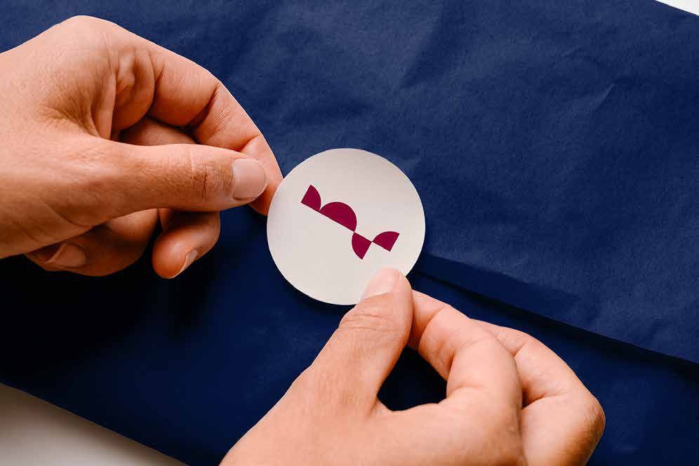
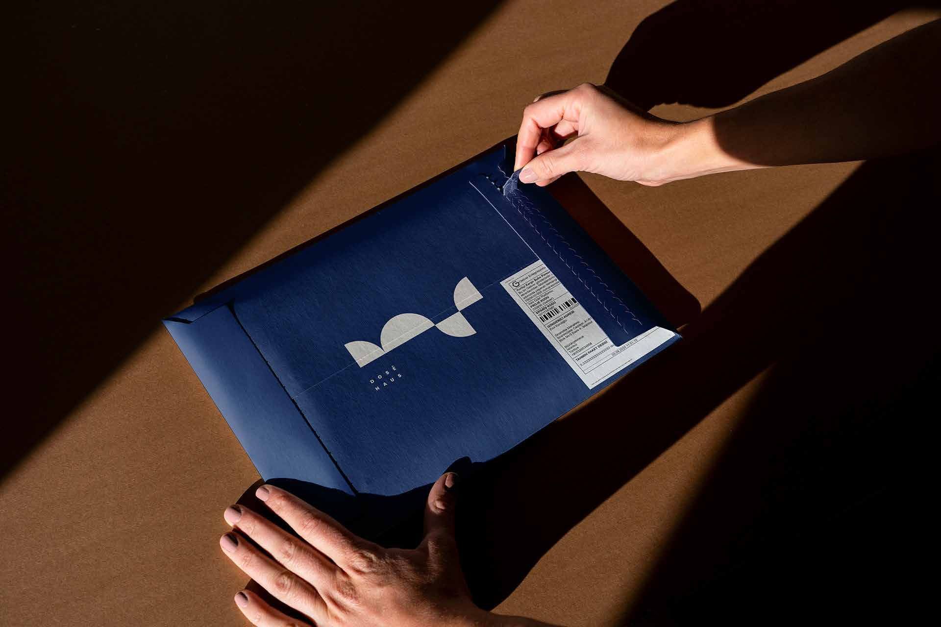
- Packaging
- Printing
Tools
- Adobe Illustrator
- Adobe Photoshop

Next
KordinatRebrand, 2025