05 / 11
Opy
- Year
- 2025
- Location
- Bogotá
- Discipline
- Brand architecture
- Credits
- Brand strategy — Montenegro Studio
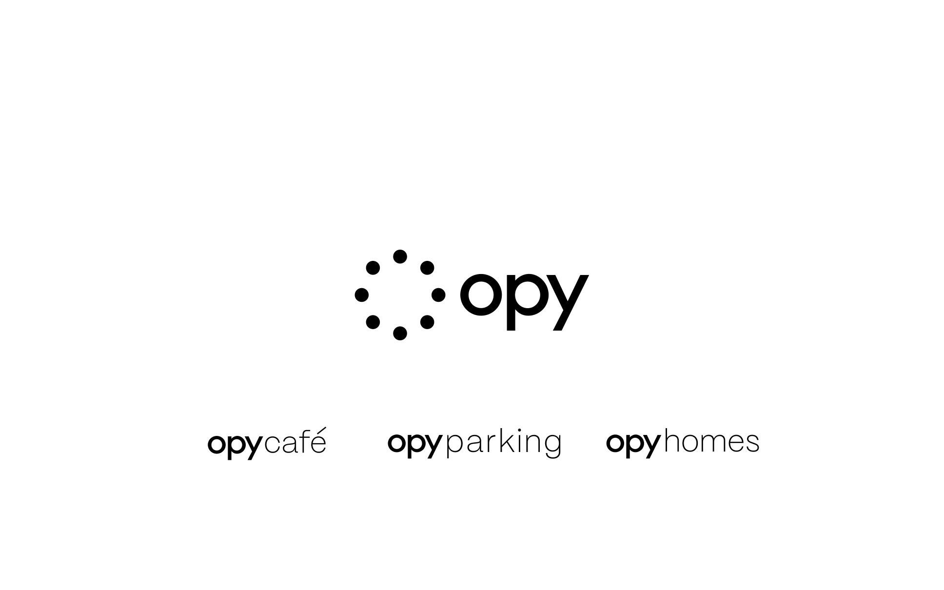
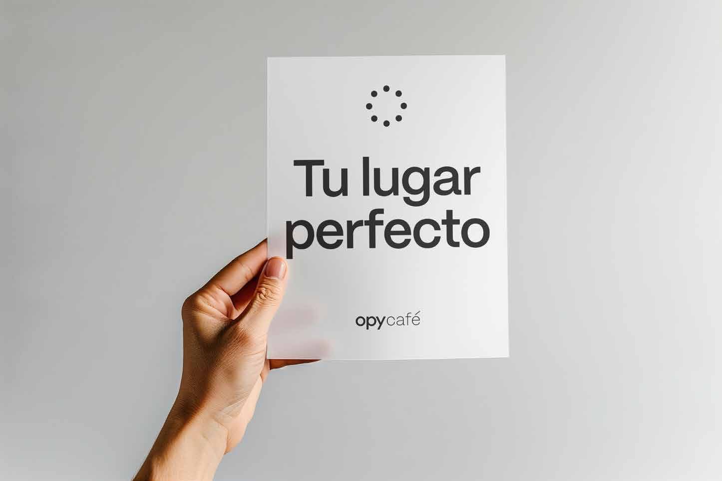
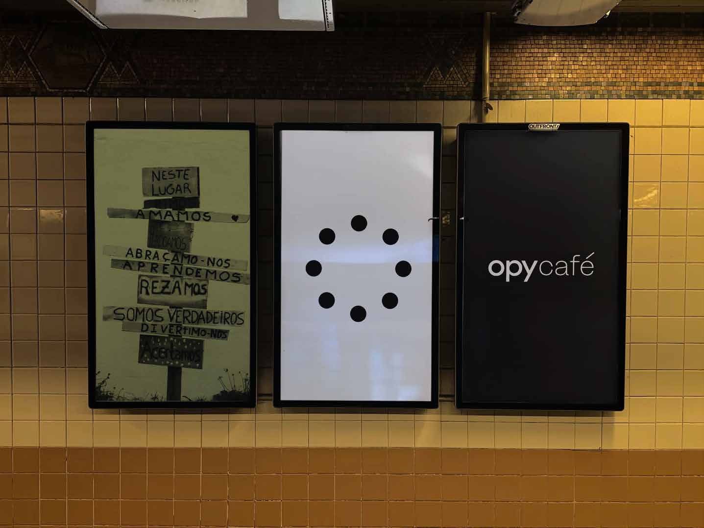
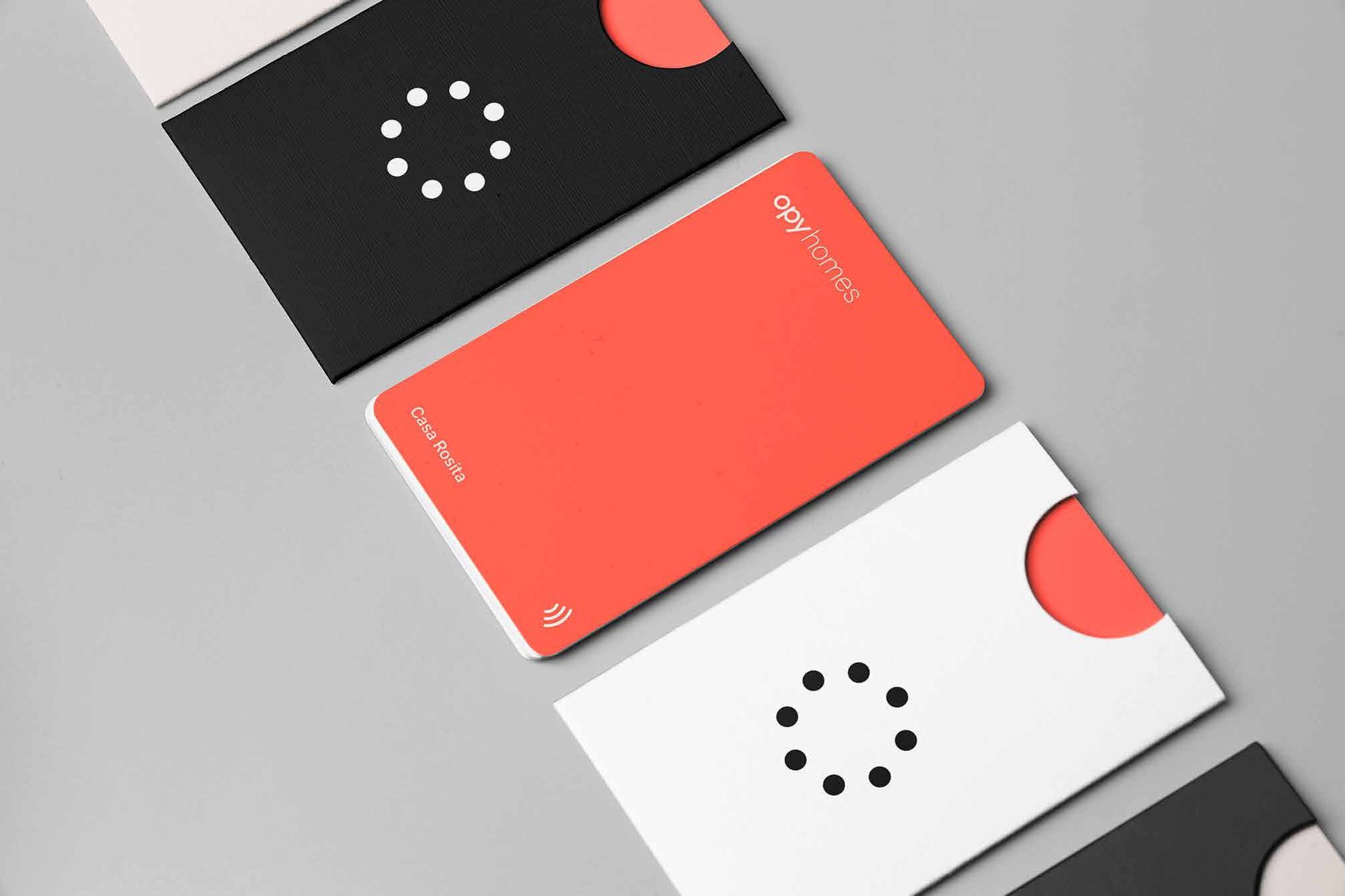
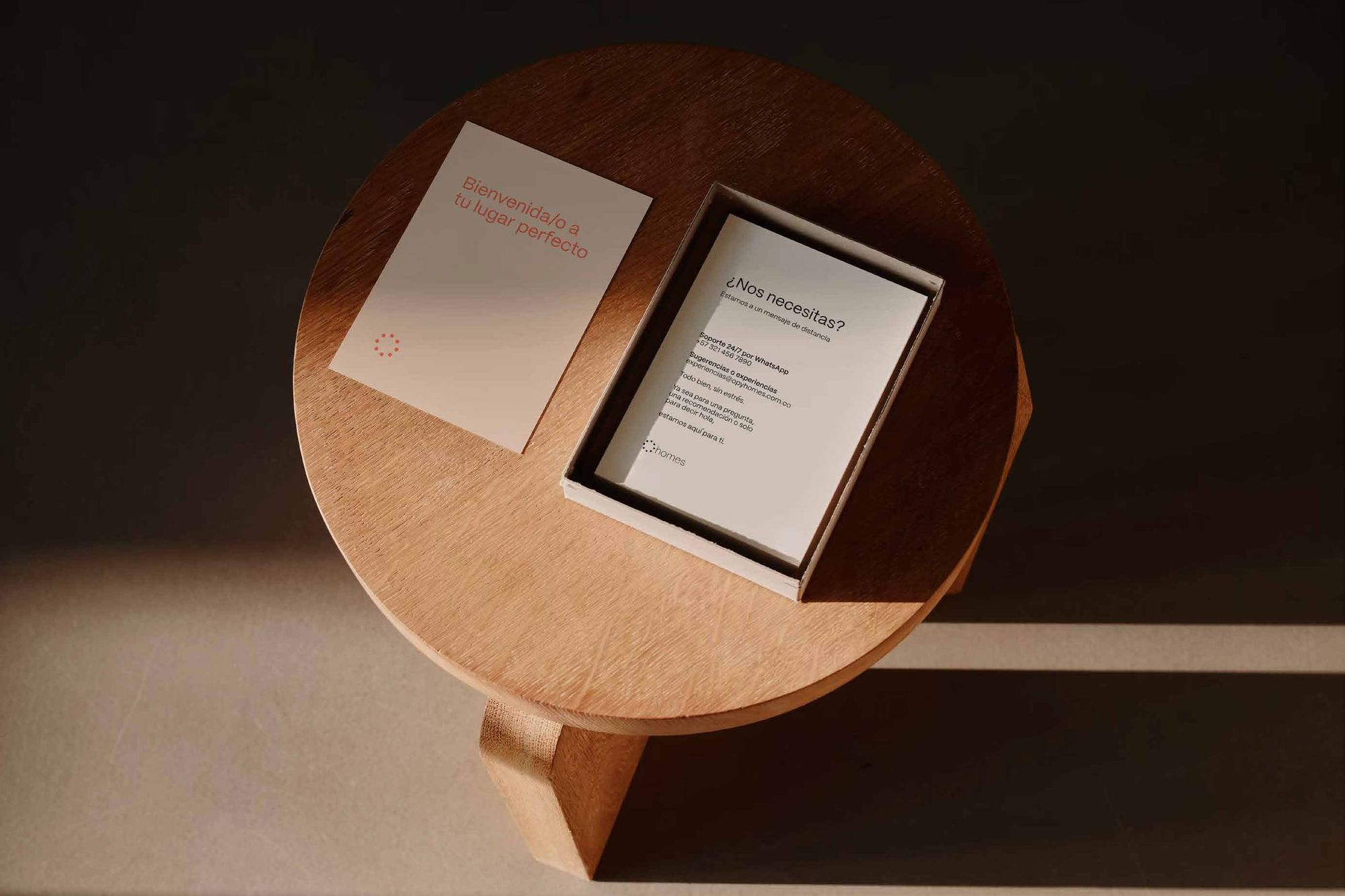
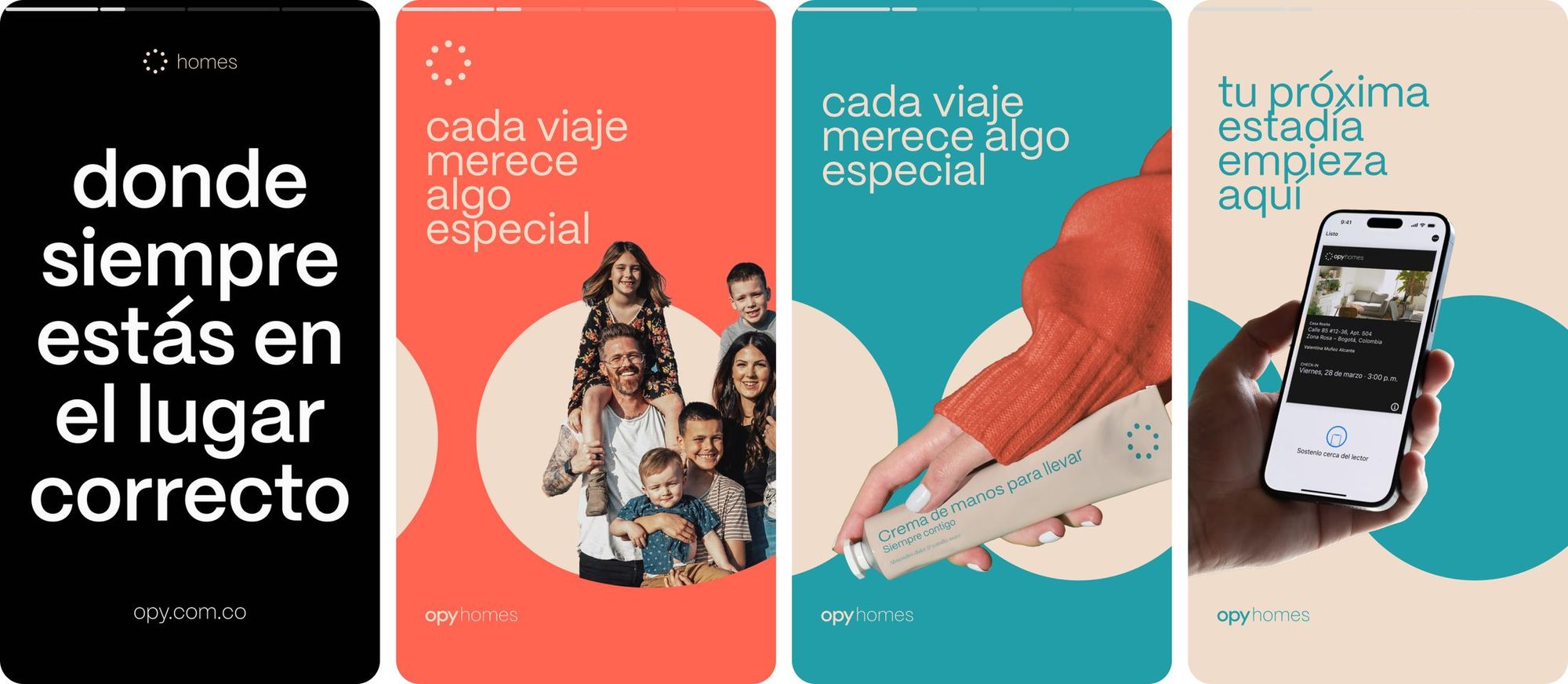
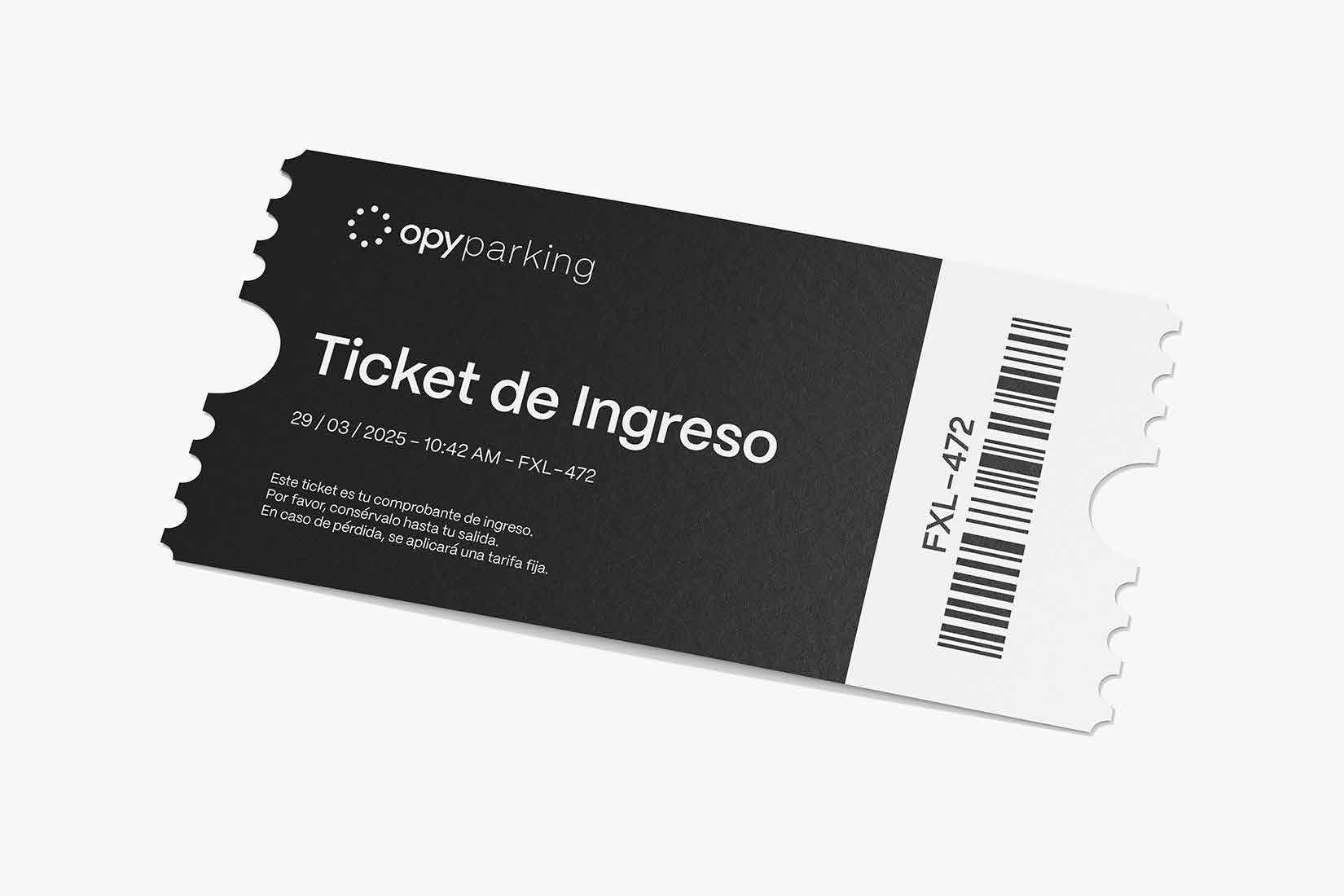
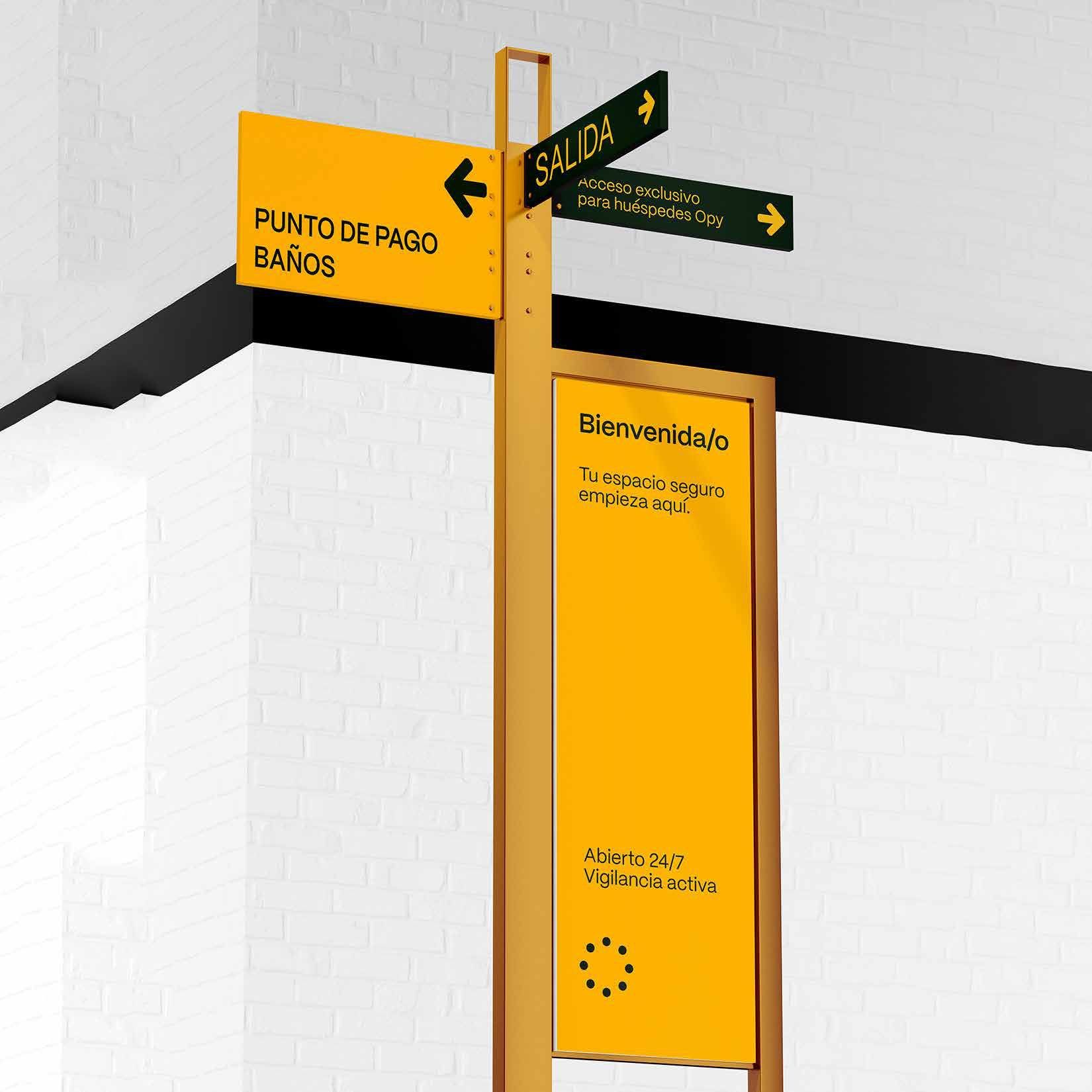
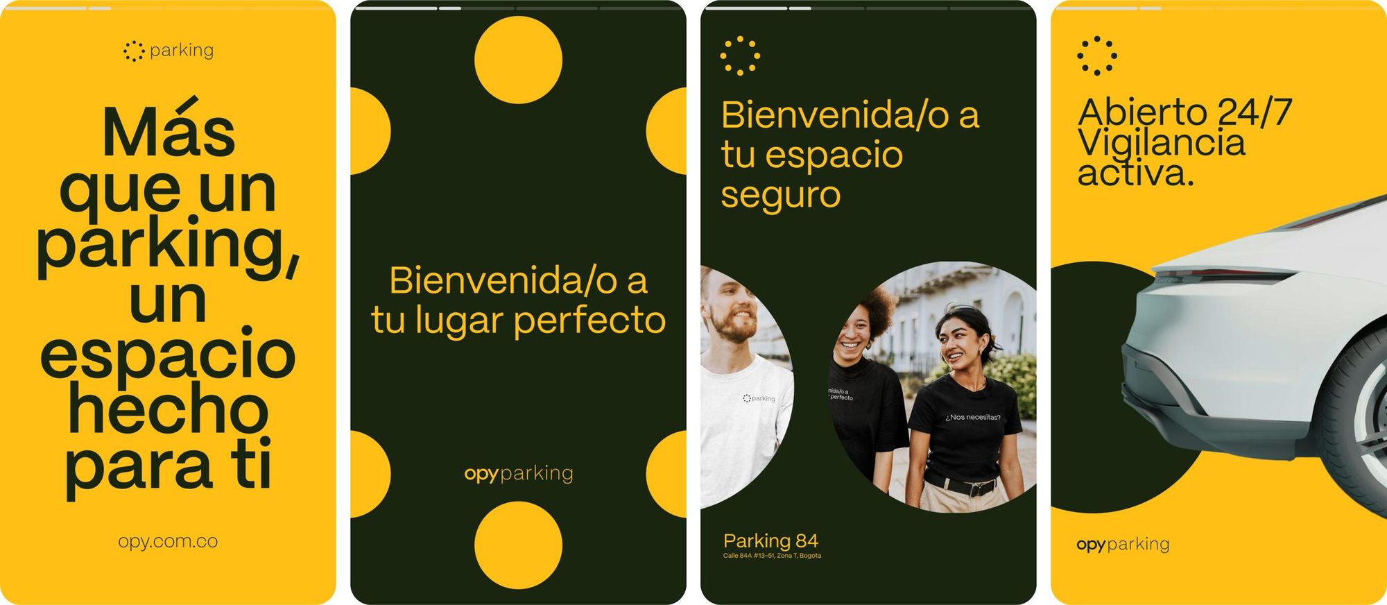
I shaped Opy's visual direction to express the brand's warm, welcoming character in a clean and understated way. Instead of building something overly layered or decorative, I wanted the identity to feel clear at first glance while still carrying a distinct personality.
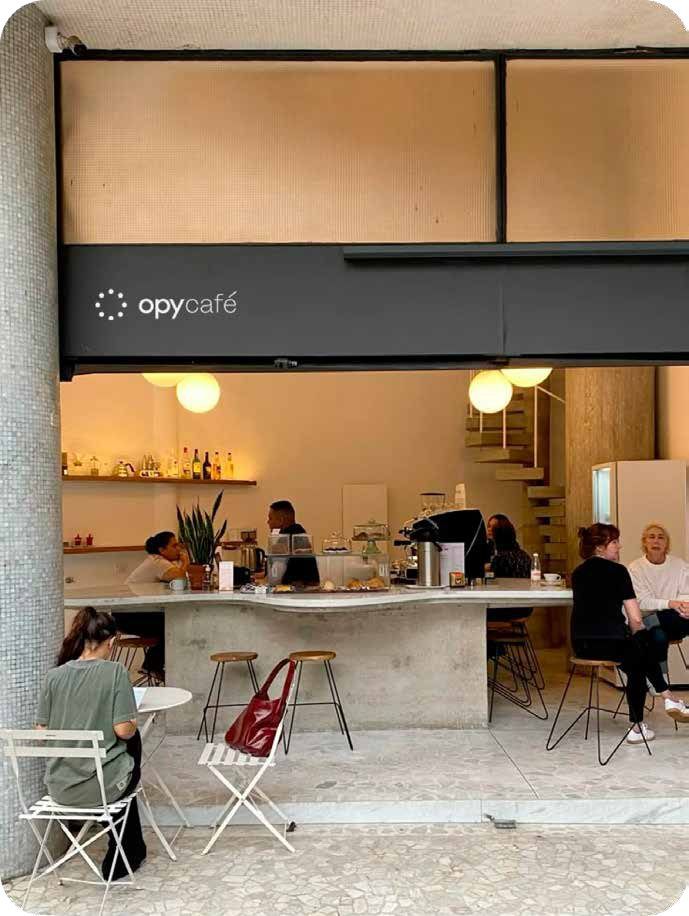
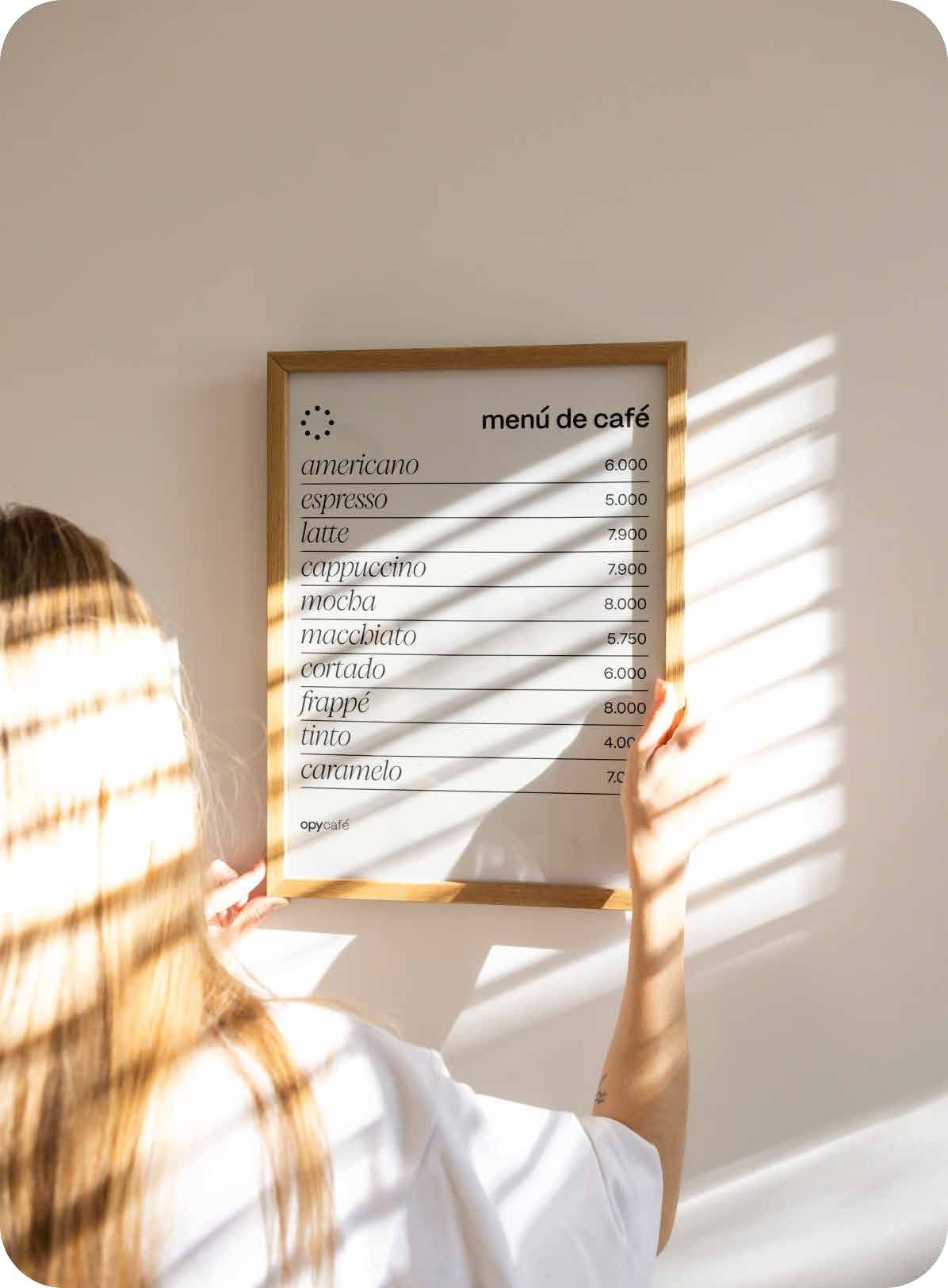
I kept the typography, spacing, and overall composition calm and intentional so the brand would feel relaxed, trustworthy, and easy to approach. That visual restraint helps Opy come across as more than just an accommodation brand, it feels like a space that gives people room to breathe.
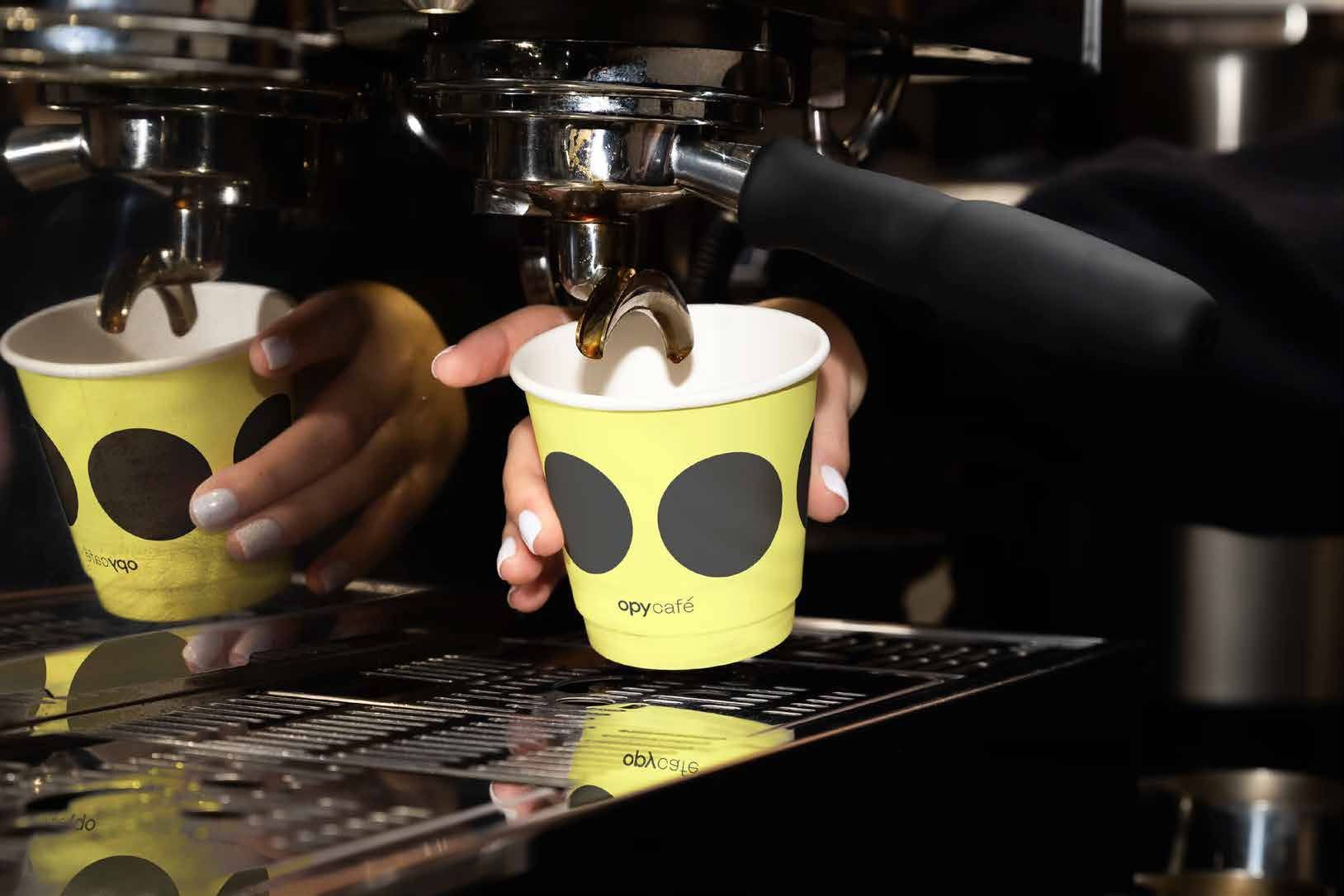
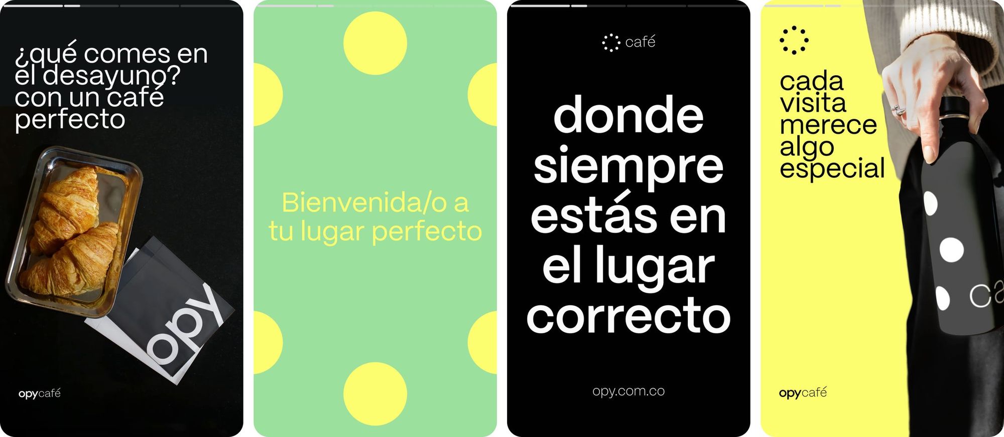
In the color and visual language, I avoided harsh contrasts and pushed for a softer, more balanced atmosphere. The goal was to move the brand away from something too cold or corporate and bring it closer to a feeling that is lived-in, human, and welcoming. This way, the brand stays cohesive without feeling rigid.
Scope
- Brand identity
- Brand architecture
- Strategy
- Color palette
- Typography
- Symbol
- Slogan
- Visual identity
- Look & feel
Tools
- Adobe Illustrator
- Adobe Photoshop
- Figma
opycafé
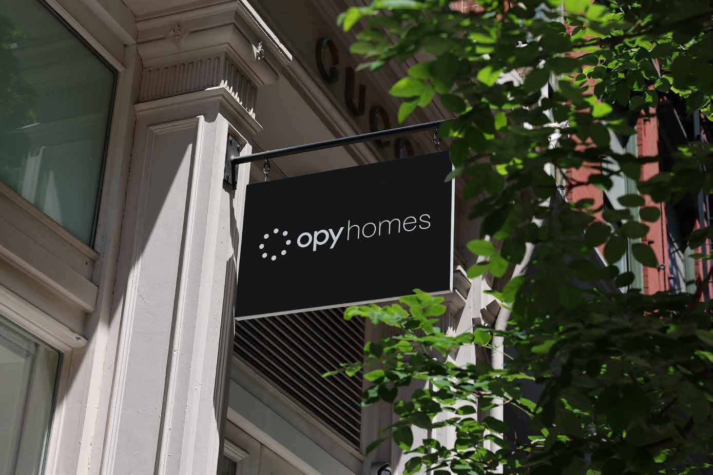
opyhomes


opyparking

Next
BluetekBrand architecture, 2023