01 / 11
Meyt
- Year
- 2026
- Location
- Barcelona
- Discipline
- Brand identity
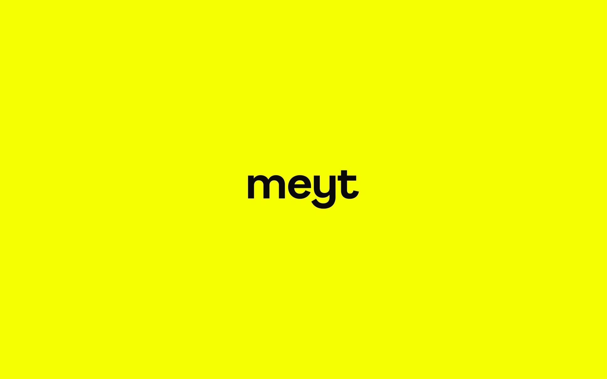
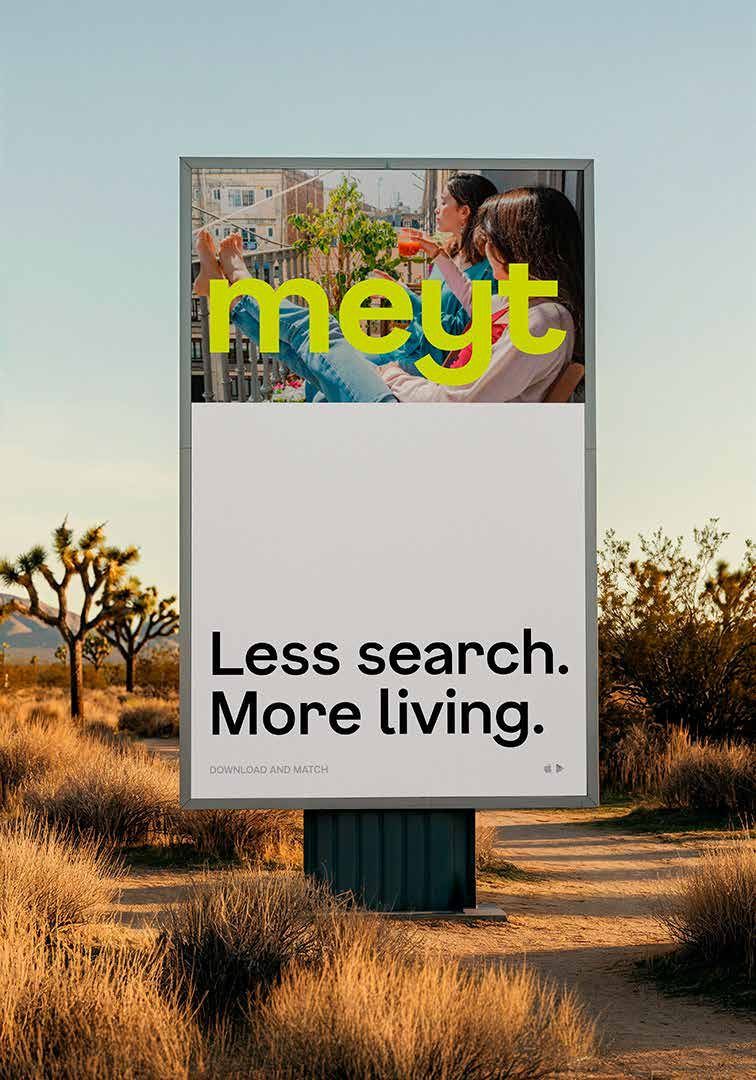
meyt was built around a simple but overlooked idea: when people move to a new city, they are not just looking for a room, they are looking for a life that already feels connectable.
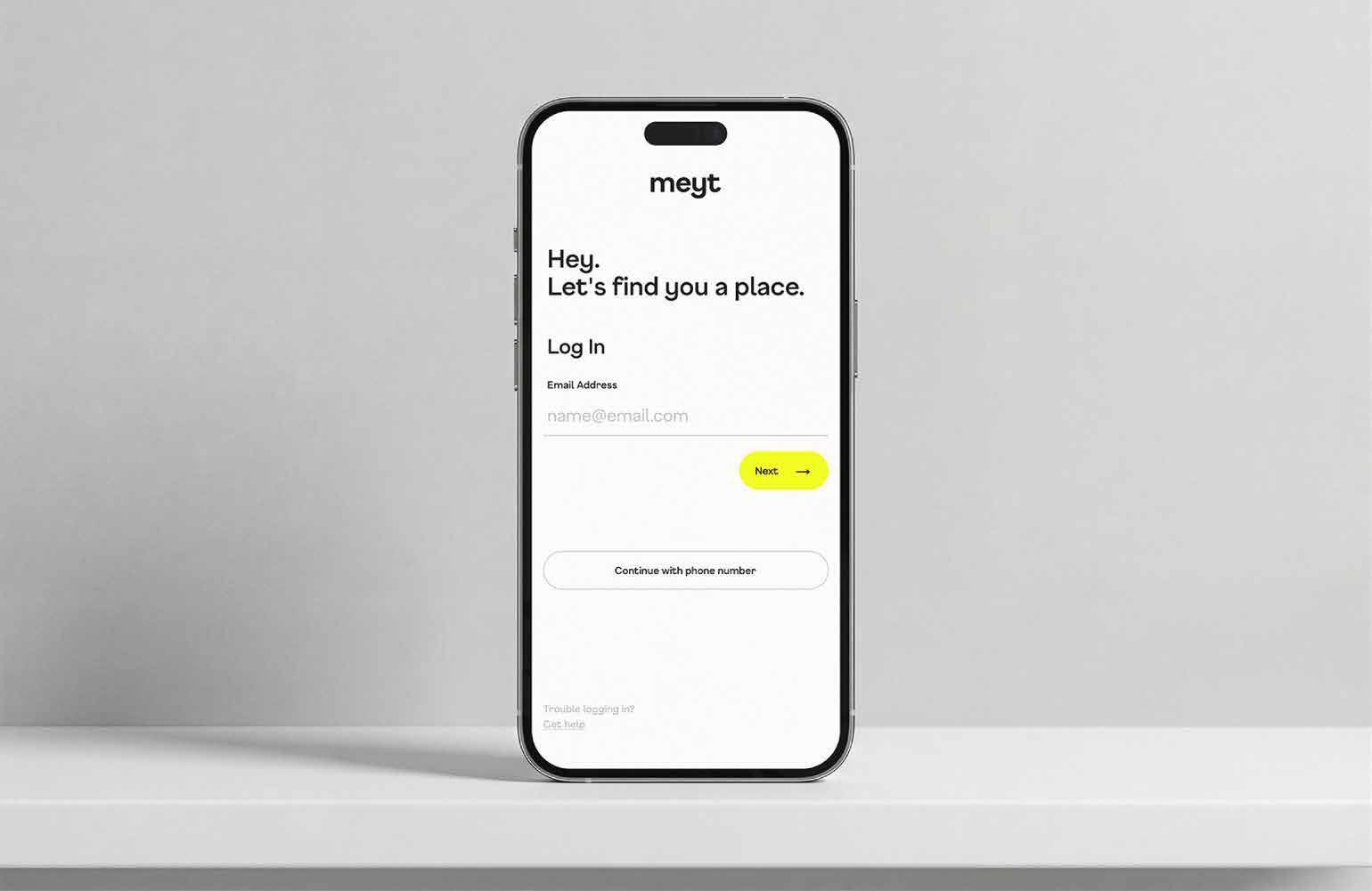
The branding project starts from that mindset and turns it into a system that treats housing as a social experience, not a transactional one. Instead of positioning meyt as another roommate or co-living platform, the brand frames it as a belonging layer for mobile lives. That shift changes everything: the audience, the tone of voice, the trust structure, and even the way the product speaks to people in moments of uncertainty.
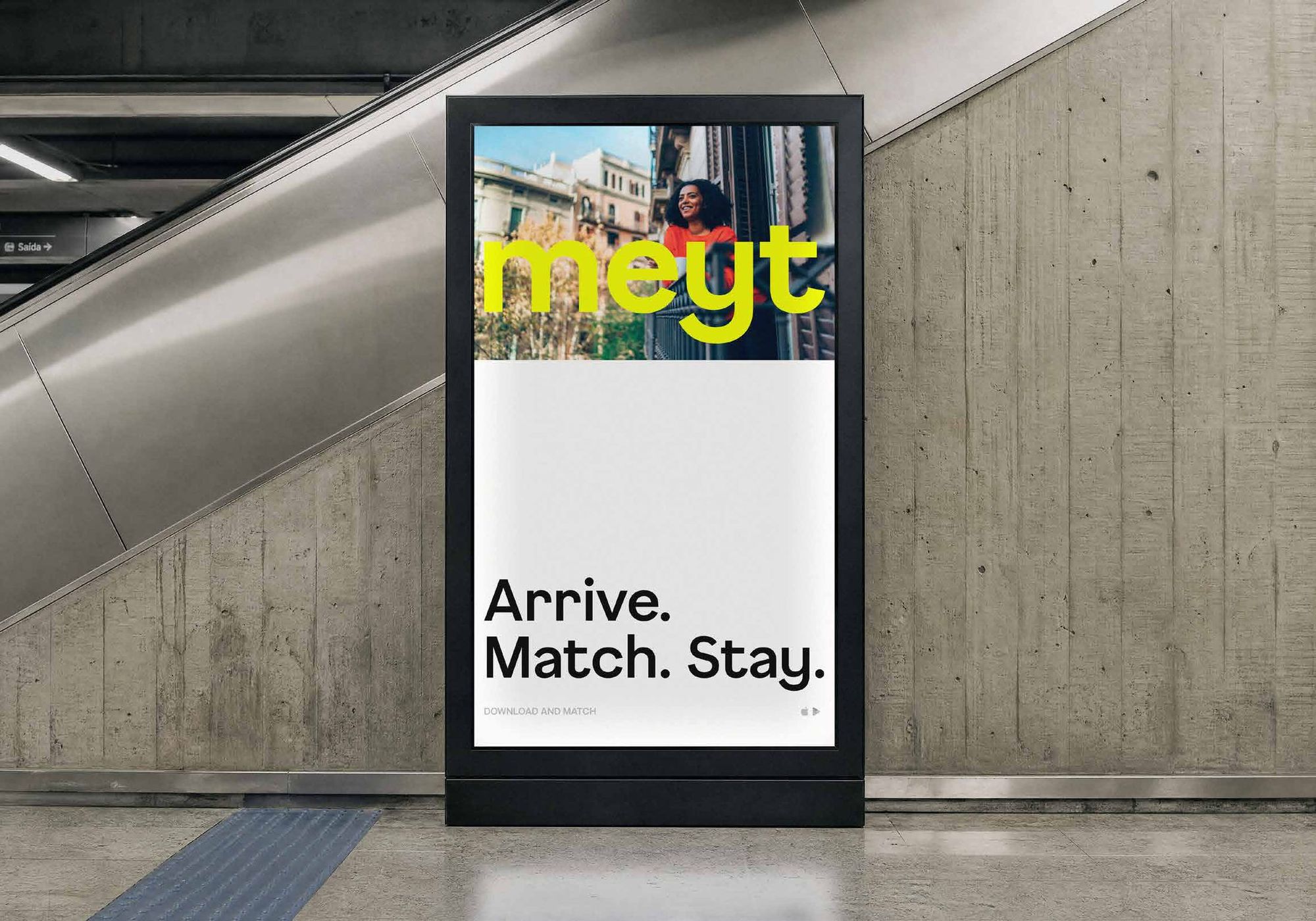
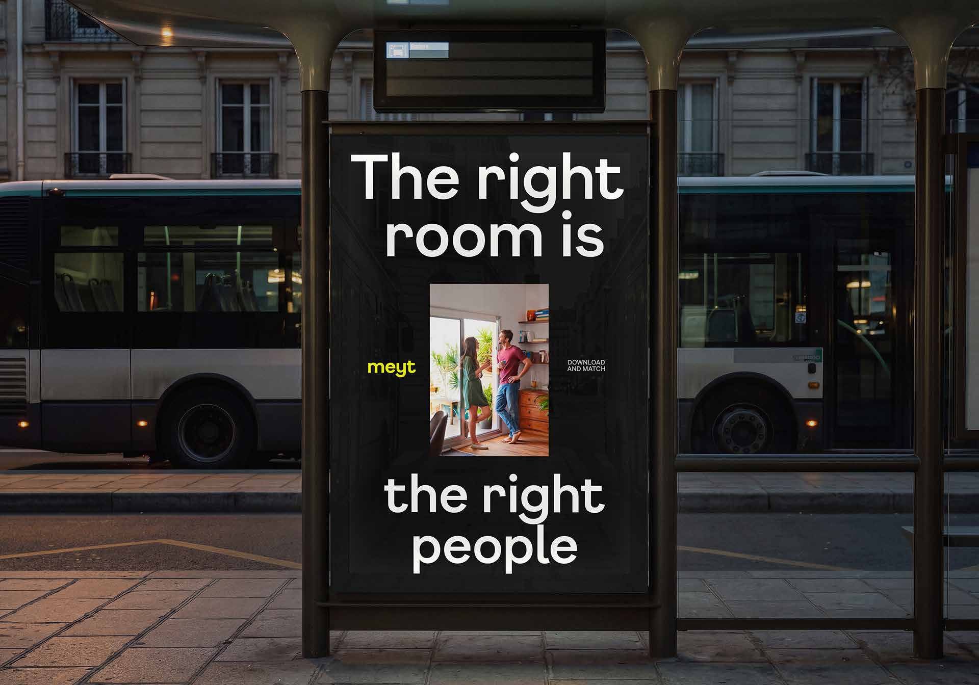
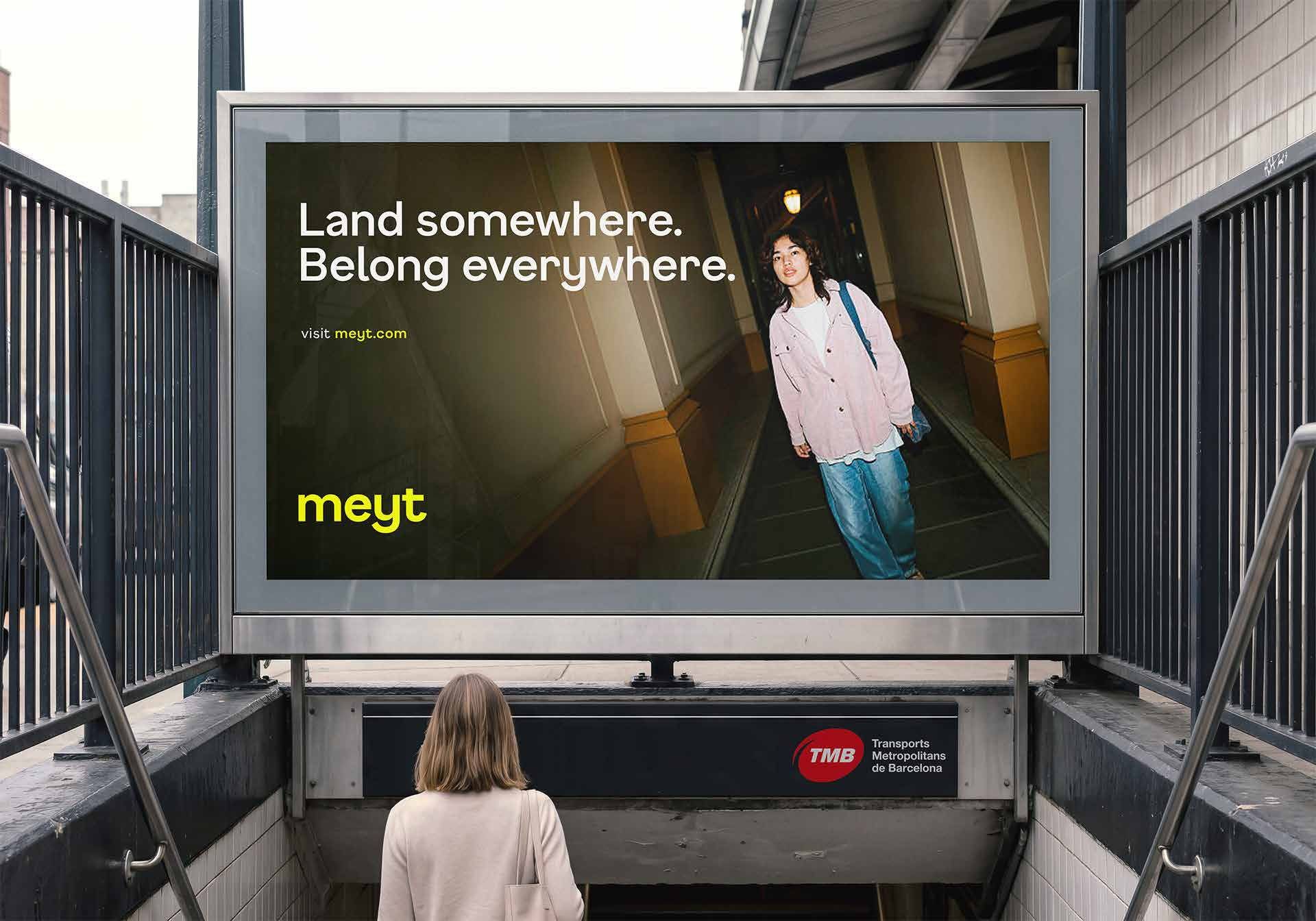
Visually and verbally, the system is designed to feel direct, warm, and grounded. It avoids overpromising or romanticizing mobility, and focuses on clarity, compatibility, and human confidence. The result is a brand that feels less like a service you browse, and more like a guide that helps you land somewhere real.
Scope
- Brand identity
- Strategy
- Color palette
- Typography
- Symbol
- Slogan
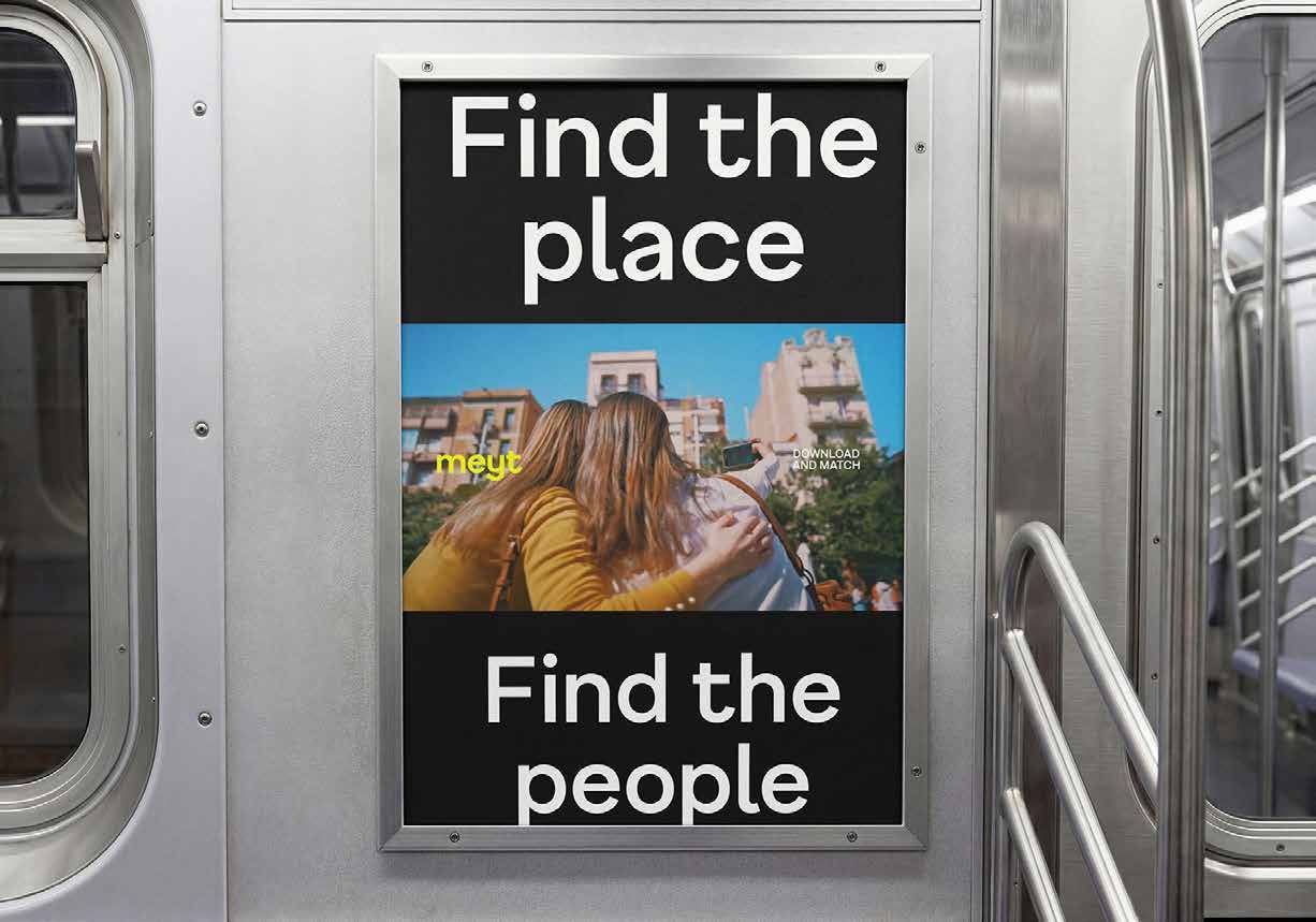
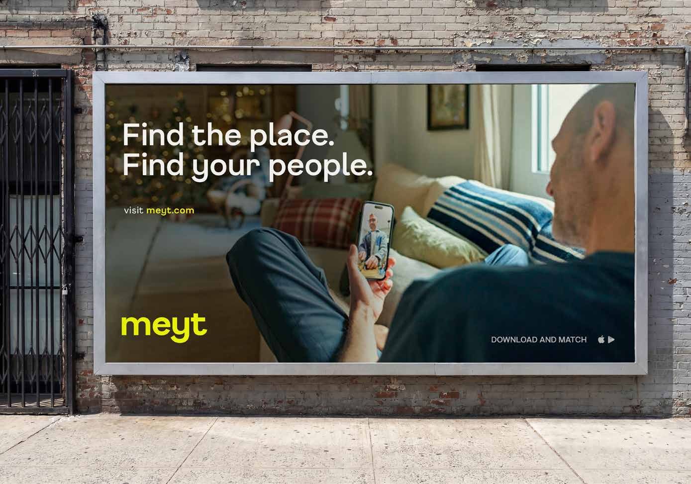
- Visual identity
- Look & feel
- Mobile UI/UX
Tools
- Adobe Illustrator
- Adobe Photoshop
- Figma
- Claude
Next
Dosé HausBrand identity & packaging, 2026